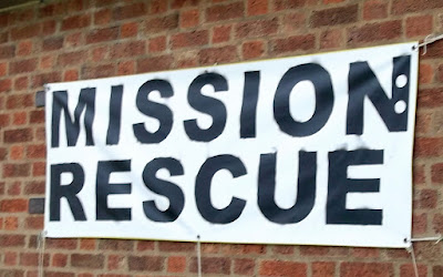
...But I Do Love A Can of Spray Paint!
Can I have a little rant? If you have something to advertise, make an effort to get your message across. I am heartily sick of posters for the charity ploughing matches, the PTA School Fayres. the fundraising event for the church bells. whatever - which are neatly produced on someones computer, printed out on a sheet of A4, and then placed on a stake at ankle height, in the grass verge by road junctions all across Norfolk. Who is going to read them?
They are too low for anyone except a passing terrier or rabbit to scan, they are too small for anyone in a moving vehicle to read - and usually they have far too much information on them.
My top tips for great banners
1 - make it large, keep it simple
A large banner hung from the fence, against the wall at least a metre high is best. You can buy these new, printed to order [allow £20+] But if you don't want to shell out the money, reuse an old banner and make your own
2 - ask somebody else for their old one
Many venues have one-off, dated banners to publicise their events which are no use afterwards [eg for firework displays, Summer Festivals, music concerts etc] They are often happy to pass them on to someone who can use them - especially in a good cause. And scrounge half used spray cans [you sold that car, but still have Renault Dark Green paint in your garage. Or you bought red, white, blue for the Jubilee]
3 - work out your wording
Event , date, time - and possibly location
Print out the letters on scrap paper and lay them on the banner to get them looking good. Choose a simple font, and letters as big as you can [minimum 20cm high, 15cm wide for visibility] If necessary add details using a smaller laminate sheet
4 - forget brushes and stencils
It is so hard to do brushwork or stencils neatly - go the other way - spray over pre-prepared letters then peel them off, to reveal a white message on a dark background. Put your banner on newspaper, or a tarp to protect the floor. Best done in a garage not on the lounge carpet. Doors open to let fumes escape. Try to avoid a windy day
5 - go off the straight line
Because one letter out of place will look so wrong - but if they are all dancing about it's OK. Use a can of spray mount, put the letters inside an old cardboard box and spray them in alternate pairs. e.g. for charity you would do c, a then h, r, then i,y finally t. This helps with the spacing and lining up. Press them down very firmly so paint cannot bleed under the edges.
6 - line up all your cans and use them in rotation
That way if one can runs out, you can still keep up the stripes. Aim for diagonal stripes about 30cm wide, and spray all the banner. Wait, wait, wait!
7 - finally peel off all your letters and reveal the banner
Drop sticky letters in that box, its no good for any other purpose!
And if you are passing through Swanton Morley any Thursday, please do call in at the Parish Church for a coffee!
Rev Rachael, my friend the vicar, makes exceedingly good shortbread. And she is very pleased with the banner I made her to publicise this new village event.


You make some lovely banners! Obviously, the people printing out small posters don't have an Angela to make their banners for them. I had to look up what A4 was! We have letter, legal, and ledger!
ReplyDeleteI must check out those US sizes
DeleteExcellent reuse! Do tell me though- if you reused a banner, did you spray it white first to get a white background? It looks marvellous! Kx
ReplyDeleteNo - I just turned it over and used the back!!!!
DeleteI regret that I wont be able to get to S.M. for this EVENT!
ReplyDeleteBut thanks for the advce on Banners.
One thing is perhaps pertinent. Remove it after the event, can't have people going on the wrong day. Lesley
That's true. We passed one outside a village pub in June saying "book now for our Christmas Specials" and it was for Xmas 2022 .
DeleteYes! Yes! Yes! I feel annoyed by the silly ground-level road-side signs which distract but are too tiny for motorists to read and just litter up the countryside. You have a good rant. I am with you!
ReplyDeleteThank you!!
DeleteVery good advice, thank you. Oh we could do with you in our village with your fantastic posters! Isabel
ReplyDelete👍😊
DeleteIt's also important that one checks all the information. A recent shop window poster, beautifully written, had omitted the date of the event!
ReplyDeleteOh dear!!
DeleteMiniature posters are my pet peeve, too. They can be quite distracting as they usually show just enough to whet the appetite, but from a car there is no time to read the details. I was very happy with our Catholic Women's League members who made a giant "Bake Sale" poster to display outside the Town Hall on the morning when they were selling inside. It could be read from halfway down the street!
ReplyDelete🎂🍰👍
Delete